Rian Hughes Interview
1st Apr 2018
A big thank you to Rian Hughes for taking time out of his busy schedule to do this interview for us. If you don’t know him already, Rian is a graphic designer, illustrator, comic artist, author, and typographer who has worked extensively for the advertising, music and comic industries as both designer and illustrator.
Rian's latest book is Logo-a-gogo. Check it out!
Could you tell us a bit about your background and the early days of your career? How did you come to be doing what you do?
I studied Graphic Design at the London College of Printing (now London College of Communication). After graduation, I worked for a variety of companies - an ad agency, two record sleeve design companies, and a brief stint at I-D magazine and at Condé Nast.
I was also beginning to draw comics, first The Science Service for Magic Strip, then Dan Dare at Revolver, and later 2000AD. On top of this, I was doing a lot of freelance commercial illustration and design for magazines like Radio Times and Smash Hits, and a full-time job became untenable. Device {Rian’s Agency} was set up a couple of years later. There was no grand plan!

How would you describe your work?
I seem to sit squarely between illustration and design. The artists I admire, the classic poster designers like Jean Carlu and Cassandre, or the Stenberg Brothers, were quite capable of manipulating type and illustration, even photography, in their image-making process. They used a variety of means to produce the image they required. The compartmentalisation of "commercial art” into specialisations – illustration, typography, graphic design – happened in the ’60s and ’70s, but the introduction of the Mac has happily blurred those strict divisions. Pulling them all together is essential to creating cohesive work in which every part is well articulated. If you look back at the early work of Jewett Bubar and Don Sturdivant included in the Custom Lettering of the ’20s and ’30s book, you can see they were consummate type designers, illustrators and graphic designers all rolled into one. It wouldn’t surprise me if they also wrote the copy!
How and when did you first become interested in typography, and what’s the deal with all the comics?
My father, an architect, had a Letraset catalogue. Almost every architect used Microgramma on their plans – it had that modern, technological appearance. Looking through this amazing compendium of typefaces, I was struck by the sheer invention. All these different evocative styles, and all derived from the same basic 26 letters (and numbers and punctuation). That fascination with the expressive possibilities of type, and especially the more outré headline varieties, still informs my work.
The comics I came to later. Growing up, I was not a huge superhero fan - I much preferred 2000AD. Marvel and DC didn’t excite me as much as the European material that was appearing in magazines like Metal Hurlant, and occasionally reprinted in English in Heavy Metal.
Serge Clerc, Yves Chaland, Moebius… these artists had a sense of design that really appealed to me, even though I couldn’t read most of the stories. My French is pretty basic.
Who and what are your greatest influences?
Artists who are aware of, and play with, the form and structure of their medium. A painting, for example, is a representation of something, a picture of a scene perhaps, but it’s also marks on a canvas – sign and signified. Graphic designers are used to working with this purer language of shape and form, and adept at communicating using it. I was attracted to movements like cubism and vorticism – which are close to graphic design, in a way – and the stylised illustration and poster design of the ’20s-’50s. In other media, the same tends to apply - I respond to Monty Python’s wilful deconstruction of the form of the half-hour TV show or film, Alan Moore at his more structurally playful, books like Mark Z. Danielewski’s House of Leaves or Alfred Bester’s The Demolished Man that play with the arrangement of type. I have just finished a novel called XX: A Novel, Graphic in which I push the expressive possibilities of different typefaces and page layouts to the limit to tell a story. I think I’ve found a tale that is uniquely suited to this kind of treatment, that could not work in any other form. This involved designing new typefaces that express certain characters or moods and pressing historical tropes into use for their cultural resonance. It’s been four and a half years in the making. Hopefully, this will be published later this year or next.
Could you tell us about the book Custom Lettering of the ’20s and ’30s, which features Over 6,500 images? That’s a lot of scanning!
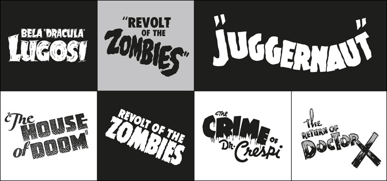
Ha! It’s a project that’s been in preparation since I began work on its prequels, the ’60s and ’70s Custom Lettering and ’30s and ’40s Custom Lettering books. I’d photograph samples of type in old bookshops, magazine archives, my collections of comics and magazines, and at dealer’s warehouses. It built slowly over quite a few years into the collections as they were published. If anything, the latest '20s and '30s volume is the best of the bunch – it shows the beginning of custom lettering as a modernist art form. There’s such invention and variety on show, a real treasure trove of inspirational styles many of which have never been adapted to headline or digital type. Their one-off hand-drawn nature means they’re much more expressive than typesetting ever could be.
You’ve work on a lot of fun and interesting projects over the years. Is there anyone you’re interested in working with, or for, that you haven’t yet?
I hear JJ Abrams is a typophile. I’m a great admirer of his TV and film work, but for me, his grasp of the metatextual aspects of design was brilliantly exploited for S, a story within a story which had postcards, clippings and other ephemera inserted between the pages. I’d love to know what he might think of XX.
Please tell us about future projects/exhibitions/books that we should be watching out for? What’s in the pipeline?
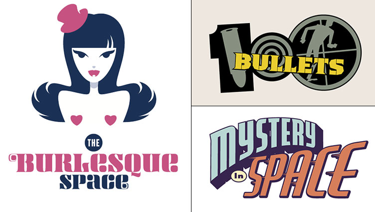
Other than XX, there’s a wordless graphic novel - the first I have both written and drawn - coming out from Top Shelf later this year. It’s called I Am A Number, and is an all-ages rumination on what happens in a stratified society in which everyone has a number printed on their shirts. There’s Logo-a-gogo, which collects most of my logo design work for comics, advertising, music and pop culture, which Korero Press will be putting out soon. This is a real labour of love – I’m showing the final designs alongside all the roughs that didn’t make the grade, or were passed over for some unfathomable reason. It reveals the process behind the design and includes many logos for Batman, the X-Men, Captain America, the Invisibles and many others. Watch out for it!
Available books by Rian Hughes
