Typeractive: 30 Years of Device Fonts
18th Nov 2025
For three decades, designer, illustrator, and typographer Rian Hughes has been a singular force in visual culture. Through his foundry, Device Fonts, he has crafted some of the most distinctive and widely used typefaces. To mark the 30th anniversary of Device Fonts, Hughes has launched Typeractive, a monumental Kickstarter project to compile his life’s work in type into one definitive archive. We sat down with him to discuss the project, his process, and the past, present, and future of typography.
You've launched a project called Typeractive to commemorate 30 years of Device Fonts. What can people expect from it?
Device Fonts is 30 years old this year, so it seemed like a natural milestone to commemorate with a big fat catalogue. The plan is to compile every font I’ve ever released, along with some background work-in-progress, examples of fonts in use, and articles on research and process. It's actually closer to 35 years if you include the early FontFonts I released through Neville Brody and Erik Spiekermann’s FontShop – or even longer when you count the hand-drawn pre-digital one-off pieces made from Rotring pen and Rubylith. It all adds up to around 300 families and many more individual weights and styles, so “Typeractive” felt like the right title. Type books are something of a specialist interest, so a Kickstarter seemed to be the best way to find an audience.

Three decades is a long time in any field. What's been your biggest revelation about what makes a font succeed?
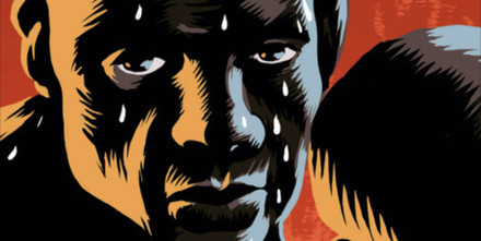
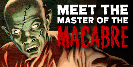
That you never know which families are going to become ubiquitous and which are still searching for their audience! Battery Park, for example, was taken from some stencilled lettering on the side of a plumber’s van I photographed through the rainy window of a New York taxi. I realised I had pretty much every letter-shape I needed to produce a full alphabet, but it took me several years to get around to digitising it, and a few more to actually release it. I didn’t think anyone would be interested, but it’s gone on to become very popular – I walked past a Banksy exhibition in London last week that uses it. As you can imagine, the more restrained and versatile fonts tend to be the most popular – Korolev and Paralucent are steady sellers. But I also have more than a few experimental designs that are probably too niche for their own good, of which I’ve sold only a handful. Maybe their time has yet to come.
Many of your fonts begin with a specific need in your own design work. How does that spark develop into a full typeface?
More often than not I have a requirement for a typeface with a certain character, and there doesn’t seem to be a font that already exists that fulfils the need. So I’ll begin with the general atmosphere I’m trying to conjure – a mood, an attitude, whether that be, say, reliable corporate solidity, or frivolous eccentricity – or even reliable frivolous corporate eccentricity. These tend to be the designs that find a ready audience. Those designs in which the idea is more technical – cropping an ascender at 45 degrees, for example – though interesting exercises in their own right, can lead to less useful results.

1995 marks the official start of Device Fonts, but your type journey began long before that. How did you get from childhood experiments to running your own foundry?
For many years I’d been creating logos and short headlines using a Rotring pen and Rubylith, a self-adhesive photo-opaque film that can be cut with a scalpel giving a perfectly sharp edge. After designing a few issues of a magazine, for example, I’d end up with a fairly complete character set, and so when Fontographer was released around 1993 these were the first fonts I digitised. Some of these ended up being released as FontFonts – FontFonts were published through Neville Brody and Erik Spiekermann’s digital foundry, FontShop. At the time the internet was still in its infancy, so they’d be supplied by post on floppy disk. It soon became apparent that I was producing more fonts than FontShop could sensibly release, so in 1995 I set up Device Fonts and since then all my typefaces have come out under the Device label.
That interest started long before then, of course – I have schoolbooks with all manner of experimental lettering doodled on the covers. My father was an architect, so I had access to Letraset sheets which I'd apply to my Matchbox cars, and then I came across a Letraset catalogue full of these amazingly diverse designs. I submitted some of my own when I was still at school – short sample settings drawn in black felt tip. None were chosen, of course, but they asked me in and I spent a day in their London offices learning how type was cut from Rubylith using a weighted knife. It was a lengthy and highly skilled process, but I was fascinated.

With countless typefaces already available, why do we need more? Aren’t there enough typefaces out there already?
No, of course not – it’s a bit like asking if there’s a limit to human expression. As long as we have new experiences to communicate, we’ll need new fonts. Do we have too many songs, too many works of art, too many new places to visit? We’re very lucky that the alphabet is such a versatile invention, one that can be endlessly reimagined and reworked. Long may it continue.
The Typeractive Kickstarter campaign is now live. Explore the project and be among the first to secure your copy of this definitive typographic archive.
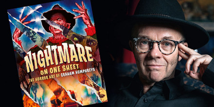
Discover more books by Rian Hughes from Korero Press: