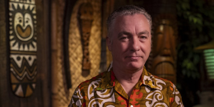
Erik Kriek Interview
Posted by Heather Adamson on 14th Mar 2022
In between writing graphic novels, playing in a bluegrass band, and drawing at the zoo with his son, Erik Kriek found time to illustrate The Set-Up – a long narrative poem about the US boxing underworld of the 1920s by Joseph Moncure March – for Korero Press. Erik is a Dutch artist who rose to prominence in the Netherlands after creating the comic book series Gutsman. He’s since developed his skills to include writing and illustrating graphic novels, among them In the Pines and The Exile. We interviewed Erik to find out more about the man behind the incredible drawings in The Set-Up.
Order your copy of The Set-Up today - £21.99
What are your top three inspirations?
Everybody asks me that question, but it’s a very hard one to answer because I’ve always been a cultural sponge. Generally, though, I’d say I look very much to American comic artists of the 1940s. I also draw a lot of inspiration from early advertising illustrations, mostly American ones, from the 1910s to the 1960s. After the ’60s, most US advertising became photographic, and as a result, the whole industry changed. But if you look at American art from the first half of the 20th century, you’ll see it’s incredible – everything, from fine art to advertising.
Did these sources influence your style or your ideas – and the things you enjoy illustrating?
I’ve never much concerned myself with style, but I’ve always been interested in the techniques people use to achieve certain effects. When I started using brush and ink, I naturally looked very closely at the illustrators who pioneered that field. In the old days, brush and ink was a way to make it easier to reproduce illustrations, so it wasn’t really an art form as such. But these days, it’s a craft.
Do you still work in brush and ink, or have you moved to digital?
I realise I’m turning into a dinosaur because I still work on paper. I must say that today’s software is so incredibly good – and it’s becoming better and better – it’s now almost impossible to distinguish digital drawings from those produced on paper. I share a studio with a couple of guys, one of whom doesn’t use paper at all. You can always see the kind of software illustrators use if they draw digitally, though; it’s very hard to get rid of that. Personally, I like the feel of paper and ink; I love the smell, I love the touch. I wouldn’t be able to go without that. It all ends up on a computer, but it all starts on paper. I’d never get rid of my brushes. The thing is, if you work with a computer, you forgo the sense of unexpectedness that a real brush can give you. I’ve been working with brushes for 30 years, but sometimes, I’m still surprised by what a brush can do of its own volition. You can’t 100 per cent control it. And that’s what keeps it interesting.

Do you have strict standards for the paper and brush and ink you use?
Oh yes, when it comes to brushes, I’m a one-brand kind of guy. I only use Winsor & Newton Series 7 Kolinsky sable hair brushes. No other brushes come close to their quality. In fact, there’s quite a nice story about the Series 7. Queen Victoria painted watercolours in her spare time, and in 1866, she ordered Winsor & Newton to produce the finest quality brushes in her favourite size, No. 7; later, the company named this range Series 7. The brushes are handmade to an incredibly high standard, and although they’re pretty expensive, if you take good care of them, they’ll last a long time. They aren’t very animal friendly, though, which is unfortunate: the strongest tail hairs from the sable (a type of Siberian weasel) are sourced from Russia to create the brushes.
Growing up, my parents always made sure that I had good drawing materials. A lot of children lose interest in drawing because they have dried-out crayons and other shitty materials to work with. If you give kids quality materials, they enjoy it more. Early on, I decided not to waste my time with crappy materials. Use the best you can afford. In the end, it’s not more expensive because you use less of the better materials.
Is your son following in your artistic footsteps?
That’s a hard thing to know. Kids always draw, but at a certain age they lose it. My son’s creative, but he has to find his own way. He likes to draw with me at the zoo. He doesn’t like the actual drawing, but he does enjoy people talking behind his back about his drawing. He’s more of a showman than me; I don’t like people talking behind my back. And he finds it funny that people think I’m his grandad. “Oh, you’re drawing with your grandson,” people often remark to me. And my son says, “He’s my dad!” People see a grey beard and think “grandad”, so it’s my own problem.
There’s a lot of artistic talent on my mother’s side of the family, so you never know when it’ll come out. Enjoying drawing and becoming a professional artist are totally different things, though, and they aren’t necessarily interchangeable. When your art becomes your job and your livelihood, it’s life-changing, and that isn’t necessarily something I’d want for my son. It’s a sacrifice, and for me, it’s still a struggle, even after all these years. It’s never easy.
How do you get in the zone when you’re working? Do you listen to music?
It depends. If I’m writing, I can’t have music playing. But I share a studio with two people, so for me, noise-cancelling headphones are the best invention since sliced bread! I wear them while listening to the radio or music, but sometimes I have them on just for their noise-cancelling effect. I have very expensive ones because they offer the best fit and comfort over the ears. But when I’m ready to ink, it’s just a manual process. I’m an avid listener of podcasts. That’s my new medium of choice. It’s incredible. I’m mad about true crime podcasts. And audiobooks, too – I can listen to stories being read to me for hours. And music, of course. It all depends on my mood.
True crime is close to the horror and thriller genres that much of your work gravitates towards.
Yeah, but it’s true crime, and it’s a lot weirder than anything I could dream up! I don’t know if it trickles down into my writing; it probably does, but I’m not sure. There are a couple of true crime podcasts that are incredibly riveting, and so well made; there’s a huge selection out there. Listening to podcasts occupies the mind but leaves the hands free to draw, so it’s a great pastime. Not very sociable but drawing and illustrating isn’t sociable to begin with.
What made you decide to make the leap from illustrating others’ works to writing your own?
The writing is something that’s been slowly developing over the years, I guess. I did a book of tales by H.P. Lovecraft, and I really liked that, but of course, I adapted the stories. My second book was adaptations of folk songs, but my first real novel, The Exile, was completely self-written. I gained more confidence with each book I did subsequently. I’m 55 now, but I still feel like I’m beginning to explore the writing. It has a lot to do with self-confidence. Maybe in the old days I was more self-conscious about what people would think of my work – afraid they’d think it was shit. The more “Fuck you” attitude I have now is something that came with age. Or maybe I found out that I really like writing; I really like making up my characters and my stories. I’ve always known I can draw but finding out that I can write as well is very exciting.

What do you do when you get to a project that you don’t enjoy?
When I was younger and on my own, I’d work 24/7. You could call me any day of the week with a job, and I’d take it, because I was like a robot. Now, if somebody asks me to do something that I’m not really interested in, I ask for a very high fee, and usually they just say no. Occasionally, they say yes, and then I’m stuck with the work! But at least I make a lot of money out of it.
I never know where my next project’s coming from. What I most like now is writing and drawing my own books – that’s become very enjoyable in the last couple of years. I want to focus more on long-term projects and big projects, like the one I’ve just done for Korero, which I worked on for more than a year. It will be all over the world, that book, in a couple of months’ time, so that’s very interesting for me. A lot of people will get to see my work. You never know what will come out of it.
While working on The Set-Up, how did you go from words to illustration?
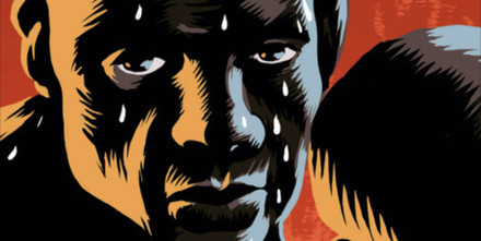
Of course, I read the poem a couple of times, and then I broke it down into chapters and took it from there. There are a lot of characters and they’re very explicitly described, so they were fun to draw. There’s a lot of caricature in the descriptions – plenty of big noses and cauliflower ears – which was easy to convey in the drawings. In general, the text is very vivid, which made it very easy to illustrate. Before I started worked, I gathered a lot of information and photographs. I always make boards on Pinterest with multiple images that I use as visual reference.
Was it difficult to illustrate a book that’s already known instead of writing your own? Obviously, people have read the poem, and some may have seen the 1949 movie adaption of it.
I haven’t seen the movie; all I know is that they changed the protagonist into a white boxer, which removes the whole sting of the poem. Yak approached me saying he wanted to create a graphic novel of The Set-Up, but when I read the poem, I immediately realised it would be impossible to make a graphic novel of it with its entire text integrated; it just wouldn’t do justice to the medium. So, I suggested we do an illustrated version of the book instead. I had some qualms at first because the poem contains a lot of racial slurs, but then I realised this was because it was written in the 1920s. I think the foreword Yak commissioned, which explains the book’s context and history, is very good. Some people may be offended by some of the language in The Set-Up, but I think they shouldn’t let that get in the way of engaging with the poem, for it’s a wonderful piece. I think it’s really ballsy of Korero to publish it in its original form.
Your depictions of the book’s characters are very respectful: you haven’t just produced caricatures.
I hope that’s how people see them. But I’m expecting some flak because that’s happened to me before. When you draw a black person, it’s very hard not to draw a black person. People just want to see a white person with black skin. If you exaggerate the nose or the lips, people immediately say, “Oh, you’re racist!” That’s so very hard nowadays. The main character is such a tragic guy, you know, so I really tried to put that forward. What can I say? A text like this illustrates itself. It’s so vivid in its descriptions.
Do you have a favourite illustration in The Set-Up?
I suggested doing a couple of spreads with a photo negative effect, so, black pages with white lettering. I really like those breaks in the book because visually, they alter the pace. I really like the one where several characters enter the boxing arena. It’s a black spread, and the light really comes through. I really liked working with that illustration, so it’s one of my favourites.

Did you enjoy creating black-and-white illustrations?
Yes, I love working in black and white. I love colour too, but black and white just give me enormous space for expression. You don’t need anything else. It’s fantastic. I also used some grey tones, so there’s a middle layer.
To create the scenes in the book, did you draw inspiration from many different sources?
Yeah, I steal inspiration! But I always use photo reference for the clothes, the cars, and so on. The text isn’t explicitly set in New York, but it’s clear that the city referred to is New York. There are a couple of street scenes that were very nice to draw. And I depicted a 1920s New York skyline; I really needed visual reference for that sort of thing. As I said, the poem just illustrated itself because the text isso good. The source material is very good.

Did you enjoy working on this project?
Yes! The poem is so incredibly strong. I show it to people and tell them they should read it out loud because it has such a fantastic rhythm to it. It’s like a rap song or hip hop. It’s almost like early beat poetry. It’s so good because this rhythm is consistent for 200 pages.
Were there occasions while you were illustrating the poem that you weren’t happy with the way something turned out?
Yeah, of course, but then I just started afresh. In general, it was okay; I didn’t have much trouble with this aspect. But in any project that you do, there’s always stuff that doesn’t work. You shouldn’t be scared to throw things out and start over. If it doesn’t spark joy the first time, it will never get better if you keep on editing it. You just have to rip it up, throw it out, and start again. If it’s a bad drawing, it’s a bad drawing. It’s part of the business.
Do you have any final thoughts to share?
Let me finish by saying that working with Korero was fun. It was an easy and smooth ride, and I really like the quality of the production. Of course, I knew that Korero’s production standard is very high, but I’m really pleased with the final results. I think they really are taking a gamble in bringing out this book because you never know who’ll buy it; it’s quite a niche market.
To pre-order your copy of The Set-Up click here.
To see more of Erik’s amazing illustrations and keep up to date with his releases, visit www.gutsmancomics.com.
Further Reading: The Set-Up: Poetry in the Ring – A deep dive into the poem's history, its 1949 film adaptation, and March's complex relationship with race.